well the first one foog made and its conker the second i made when i was dperessed and when it was 4:00am but mine usually suck any wayOriginally Posted by pyrocrow
Results 21 to 40 of 975
Thread: Signature Showoff Thread
-
11-11-2005, 06:01 AM #21

-
11-11-2005, 06:24 AM #22
-
11-11-2005, 10:59 AM #23***** Elder


- Join Date
- Aug 2004
- Posts
- 2,523
-
11-11-2005, 11:26 AM #24
-
11-11-2005, 01:05 PM #25
-
11-11-2005, 01:10 PM #26***** Elder


- Join Date
- Aug 2004
- Posts
- 2,523
-
11-11-2005, 03:04 PM #27Veteran


- Join Date
- Oct 2005
- Posts
- 112

-Dannation, despite its hugeness i think it rocks. With all of the reflections and fancy things i don't know how to do it put me in awe. 9.5/10.
-Blindspot, remeber he said he forgot to make it smaller and i think it would be a good idea to explain why you dislike or like a sig when rating it.
Ok guys this one is a redo of a previous sig that didn't turn out so great. I add a few new techniques to emphasize parts of it. Tell me what you think.
Last edited by tyrannt; 11-11-2005 at 03:06 PM.
-
11-11-2005, 06:42 PM #28

tyrant not bad for me its to plain 6/10
blindspot your size is to big but other than that its ok need to work on brushing and blending 6/10
dannation unique as always 8/10 its looks very cool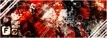
Please vote for us, it takes you 5 seconds.
-
11-11-2005, 09:03 PM #29


My current signature. Made it in about 1 hour so be nice.
Frogman very nice Signature. Though i dont like anime, but the background is very well done. ill give u 7/10

.gif)
Last edited by Harmoni; 11-11-2005 at 11:26 PM.
-
11-12-2005, 12:16 AM #30

what with all these big sigs?
not bad harmoni dont like text and there is no border 5.5/10
Please vote for us, it takes you 5 seconds.
-
11-12-2005, 12:21 AM #31

Harnomi- I can only see the bottom sig. It's to big. I wouldn't use bryce for sigs, it's more of a wallpaper program. 3/10
Tyrant- your abilities are getting better, but don't forget the basics, like good brushing and I don't like the big white border. 6/10
Dannation- Take out the render and your golden. 8/10
Sparta- Those are awful. The text is too big, the render is too small and overblended. Don't use outer glow on a render. Get a smaller border and download some new brushes. 0/10
-
11-12-2005, 12:37 AM #32

Pyrocrow. What program do u recommend then for siggs? using PS... Though im still a rookie on ps and would like some nice tips..
.gif)
-
11-12-2005, 12:51 AM #33

photoshop cs 2 should be used also we cant see your sigs(use imageshake or photobucket)
and sparta go to pizel2life and get some tuts
Please vote for us, it takes you 5 seconds.
-
11-12-2005, 12:58 AM #34

Okey. Current signature now. Find it one of the best i've done. Rate or complain!
Last edited by Harmoni; 11-12-2005 at 05:16 AM.
-
11-12-2005, 06:26 AM #35***** Elder


- Join Date
- Aug 2004
- Posts
- 2,523
-
11-12-2005, 07:27 AM #36

Harmoni- you overblended the render. Use a lower feather. 4/10
Blind- what's the difference? They look the same. Either way I like it. 8/10. Work on brushing.
-
11-12-2005, 07:47 AM #37***** Elder


- Join Date
- Aug 2004
- Posts
- 2,523
-
11-12-2005, 09:26 AM #38Veteran


- Join Date
- Oct 2005
- Posts
- 112

well i have to say good job Blindspot. 9/10. Its lacking creativity though.
Here is my latest sig, Im trying to get away from anything grunge and do stuff that no one else is doing. Keep in mind that the brushing is there just not very visible. I used the brushes as lighting effects rather than background.

-
11-12-2005, 10:00 AM #39

harmoni its niice 6/10
tyrannt
harmoni its niice 6/10
tyrannt its not bad 8/10
blindspot its not bad at all 8/10 just the size is to big for me and the render is to blurredLast edited by FrogMan; 11-12-2005 at 10:00 AM. Reason: Automerged Doublepost

Please vote for us, it takes you 5 seconds.
-
11-12-2005, 11:11 AM #40***** Elder


- Join Date
- Aug 2004
- Posts
- 2,523

The render is supposed to be blurred...
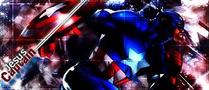
This is what I did, I filled with black, brushed, repeated with a new layer > overlay, than I added the render, and used the single coloum marquee tool over the yellow strap, his hand and the red jacket , duplicated the layer and stretched it over to the left / right of the sig, and changed the opacity and fill, than I duplicated the render layer 3 times, filter > blurr > motion blurr with a radious of 35 and did this for all three duplicated layers and placed them under the origonal render layer, and set the origonal render layer to over lay, creating the blurr, than I added the lines blah blah :P
Just wanted to show you / tell you WHY it's blurry That's why it's blurry...
Thread Information
Users Browsing this Thread
There are currently 9 users browsing this thread. (0 members and 9 guests)
Similar Threads
-
Signature showoff thread
By Foog in forum Graphics and ArtReplies: 279Last Post: 11-09-2005, 08:36 AM -
Signature/Avatar Showoff Thread
By Foog in forum Graphics and ArtReplies: 845Last Post: 10-03-2005, 06:50 AM -
Sig/Ava Showoff Thread
By Fuji in forum Graphics and ArtReplies: 751Last Post: 07-14-2005, 06:28 AM -
Sig/Ava Showoff Thread
By Anferny in forum Graphics and ArtReplies: 536Last Post: 05-05-2005, 10:23 AM -
Signature Showoff/Rating Thread
By Muderman24 in forum Graphics and ArtReplies: 1460Last Post: 09-16-2004, 02:40 PM




Bookmarks