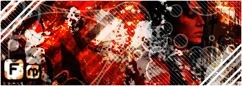
SBA- careful not to use up that style too much, it'll get old quickly.
Cherryqueen- The top one is definitly too multitonal and to be honest, get some different brushes. It's boring. Make a multi-pixel border in more than just the corners. And blend the render a bit more. 3/10
The bottom one- I see you got new brushes. You did a good job creating depth, but stick to not so contrasting brushes. It's like the foreground and the background have two very different brushing styles. Feel free to take out the tech brush. Again, get a new kind of border and blend the render. Also with the render, sitck it on a layer above color balance and hue, and blend it more.
LOD-The top--The border is the only thing going for it. The render is too overblended and the text is difficult to read. 2/10
-The middle--The text is slightly better. Download new fonts and brushes, they're very generic. I don't know wtf you do to your render, but don't allow brushing to show over it. Raise the opacity or don't blend so much or something. Make it stand out more. And use more colors. 3/10
-The Manip-- Over-saturated and over-contrasted. It's a bit bright and monotonal, which I don't understand, because the original picture made it easy to manipulate multiple colors. The border is a bit too obnoxious.
-The bottom one--The text is slightly better. Download new fonts and brushes, they're very generic. I don't know wtf you do to your render, but don't allow brushing to show over it. Raise the opacity or don't blend so much or something. Make it stand out more. And use more colors. 3/10 (yes I copied and pasted, they're all about the same)
Bigdeath- I dig the pixel strecth. And the background and animation are decent. The border is cool. But the render is overblended and needs to stand out more from the background.
Holy hell that's a lot of rating.
Edit to rate the new guys post:
-top one--Too much generic text, the background is too liquified (is that liquify, 'cuz it looks like it) Try to blend the render and add a border. 2/10 It doesn't require much effort.
-Second one-- Too monotonal, the border is weak, and the render needs blending. It's also a little dark. 1/10
-Third one--Blend the render, add a border, and quit going to 100 on the saturation and contrast. The animation is the only thing going for this sig. 3/10
-the 3 CS--Get a more defined background, and find a color scheme. Quit with the generic subtext and completely fade the animation. And please, blend the render. 2/10 on all of them.
-Vash-- umm. I don't want to hurt your feelings on this, but...Keep the gun in the color scheme, and seriously, don't drag the bar all the way on saturation and contrast. It's a queer size and it needs a border. Don't blur the brushing together, leave it defined. 1/10
-Slash--Is there a render in that thing? You're getting better at manipulating colors, but the text and the bg still suck. 3/10
-Offspring--What is the supposed to be used for? That's a very random size. And quit liquifing it. I know it is on this, because I see the twirl. The text is bad, and I don't like how the render sits like that. Plus again with the sat, and con. 1/10
-The one below offspring-- Finally a color scheme!!!! but the same stuff aplies out with the bg, the sat/con, and the text. 4/10
-2nd naruto sig--ooh, butterfly brushes. Neat. Don't text over the render soo big and obvious. Blend the render still, and a good job with the sat/con (finally) 6/10
-banner--Did you bevel the entire thing???! The text is a bit better, though it cover one of the renders. And when blending the render, leave the opac at 100% and just use a vector mask. Good use of stroke?
-2nd from bottom--The render should all stand out in this, not just the globe. At least use finally have some brush definition. It needs a border and the text is slightly obnoxious.
-The last one--Definitly your best one, the brushing is pretty good. But the render is too small, and the border is weak. Otherwise gj. 7/10
An example of what I mean by defined background. (not liquified) Like look at my sig's background, I don't mean to brag, but that's good.
40 mintues on one ****ing post!!!!
Results 121 to 140 of 975
Thread: Signature Showoff Thread
-
11-21-2005, 03:58 PM #121

Last edited by pyrocrow; 11-21-2005 at 04:28 PM.
-
11-21-2005, 05:06 PM #122

*Erm* To defend myself at your outrageous ratings.. I know everyone has their own opinions and such, and I know you don't want to hurt feelings and all, but in all due respect I must defend my work.
1st Signature - I made this for someone else... They gave me what they wanted and I worked with what I had. And I do not Liquify any of my backgrounds. For this one I added a bit of a Swirl to it, not too much though, just enough to make a little difference.
2nd Signature - This one I used both renders and brushes.. Most I only use Renders on though. With the image that I was given, I was only able to do so much with it. To make MC look even the least bit DECENT I had to make it as dark as it is.
3rd Signature - This one is complicated to explain. I don't set neither to 100%, it's just how I blended the layers together on why it looks the way it does.
Counter-Strike Sigs - For these I wanted to use the same Tech. but wanted them each to look different from eachother, unique. Which I accomplished what I wanted. Not only did I try to compleate all 3 of these at the same time, I started getting hasty with them because I had to leave for my next class soon.
Vash - I know it isn't perfect, I didn't try on it at all.. I just threw something together in my College class because I was bored and had nothing better to do.
Slash - I wanted a fire effect, but it looked plain and I can't exactly use pictures from Runescape with it, since none would fit with it. You can only work with what you are given.
Offspring - It is meant for a background image. When I upload a large picture to Photobucket it sometimes changes the size. The font I used is FROM an Offspring title, it fits with what it is with.
The one 'Below' Offspring - I can't say anything really about this, it was simple to put together, all I did to finish it off to give it a 'look' was to crome it.
The second Naruto Sig - This took a long time to make, I didn't make it like you think I did... Those Butterfly's aren't brushes, I simply too a picture, trimmed the outline, changed the color to black, and put it in cetain places. The whole background is from renders and blending (Like most of my sigs are from.) I had to make it look like sand, since that is what Gaara uses.
The Banner - Yes, infact I did. I wanted it to stick out, and give it round edges.
Apoc - Uhm, again. If you saw the previous original image, you would understand why I had to do what I had to do in the picture.
There are other thoughts I have, but I don't want to outburst...yeah.
-
11-21-2005, 05:22 PM #123
 I do believe you just did. I gave you some constructive criticism. I don't always get 8 and 9/10's, so settle down. I don't want to act like I'm perfect or anything, but I supply a bunch of people with their sigs, and I know a fair amount about photoshop, so until someone else feels like rating all of your sigs, take the low rating, and settle down. btw, if you were looking for 9-10/10's, don't just expect them. A 7/10 is good. And I've had my fair share of 1-4's, as had everyone else. Follow some of my advice, and try to improve. But settle down and don't be outraged every time you get a bad rating, I'm doing this to help you sigs from a strictly visual aspect.
 Originally Posted by Xyrin
-
11-21-2005, 05:35 PM #124

I am not outbursting at you, as I said, you have your own views. I was just filling you in on what I had to work with on my signatures that you burst out at..
And if you think about it, do you know how low a 1 out of 10 is? Think of how obserd a Photoshop job would have to be to deserve a 1?
Not trying to yell at you or anything, but as I said, everyone has their own seperate opinions, no hard feelings, eh?
-
11-21-2005, 05:52 PM #125

xyrin this is a thread where you get rated and there is no idle chit chat
your current is the best one nice border and text placement, render is to blurred and not blended well enough, and your brushing needs more contrast to it 7/10
cheeryqueen its a nice start but you need to get some new brushes from deviantart 5/10, and you need to work on multi colour (you can visit my sig tut to see how to multicolour, thee is a link at bottom of my sig)Last edited by FrogMan; 11-21-2005 at 05:55 PM.

Please vote for us, it takes you 5 seconds.
-
11-22-2005, 02:33 AM #126

Do be sad children... its salisbury steak day

Sig made with Gimp2.4 Free alternative to photoshop.
-
11-22-2005, 08:29 AM #127

...>_> Pyro, I think Xyrin diserves a better rating then that. I don't care if you hate them or not..that's a pretty sh*tty rating.
Eh...okie, I hate being yelled at or being in the middle of sh*t so I'll leave it at that.
*Snuggles Xyrin* n_n; Mine. <3Last edited by Cheeryqueen; 11-22-2005 at 09:06 AM.
-
11-22-2005, 10:14 AM #128

first of all this is no chit chat thread this is rate the sig above you and then add a side note if needed, second xyrin having looked at the sigs you posted most of them are not that good, only the last 2 are decent (6/10,7/10), all of us have being criticized for our sigs here at one point or another (like my last posted sig was given a bad ratting considering my level)
it doesn't matter what you had to work worth, its what looks good, take pyro's advice and take mine go to deviant get some brushes, look at some tuts you can even look at my tut or foogs tut on this forum(link at bottom of my sig), or go to pixel2life and look at tuts, everyone here reads up on tuts.
and cheeryqueen you did the same mistake, also you got good potential to make good sigs listen to the advice i gave xyrin
bigdeath like the changes to the sig but needs a border and but a bit of a time delay on those flames and the render is much better this time, 5/10 make the changes and i will give a 7/10
Please vote for us, it takes you 5 seconds.
-
11-22-2005, 10:37 AM #129

i think everone here is better than me i suck hard core, and X whaterver...here this is what you wanted to here rite there all 10 out of ef-you-see-kay-eye-en-gee 10's as for the rest of you, no one is a mod not evena me so do what you plz dont listen ne one or the rules idle chit chat is somtheing we all do...fact im doing it rite now, tho im guessing im gitting warned for this! lol yes
-
11-22-2005, 12:25 PM #130

Yeah. Stop the small talk. Someone's already been warned.
-
11-22-2005, 04:17 PM #131

anyways i know this is off topic in the sig avatar show off thread ... so mods im sorry but im posting a sig in here. hope its the right place. seems like d2sector chat thread. lol jk dudes. anyways. here is my awsome sig. i read like 30 tutorials to make this bad boy. took me like 8 hours and stuff. SBA notice the bad a$$ brush work dude? its rockin.
my best one yet . i got the render from .... uhh cant reveal my sources. LMFAO. THIS IS RAD. RATE IT WOMEN.

-
11-22-2005, 04:23 PM #132

Dann= That border is effin' sweeet. But for making the shit brushing, 35x10 to the 99th/10. JK, 3/10

meh. CnC plz.
Sorry for starting some chit chat, if that could be blamed on anyone.Last edited by pyrocrow; 11-22-2005 at 04:44 PM.
-
11-22-2005, 04:29 PM #133

yo yall check this its funny as hell my friends first time to use photoshop

Last edited by bigdeath; 11-22-2005 at 04:42 PM.

Sig made with Gimp2.4 Free alternative to photoshop.
-
11-22-2005, 09:21 PM #134

k, i revamped the hitman signature, with a little more background stuff and a little colour change.. please re-rate

-
11-23-2005, 04:05 AM #135

pyro its not that great, there is no bg to it 5/10
snap very nice 8/10 just you could of blended it a little more and make it a multicolour
Please vote for us, it takes you 5 seconds.
-
11-23-2005, 08:20 AM #136
 I wanted to tell you this FM. On the top of Spidermans head, you shouldn't have put that part in the color balance mask.
 Originally Posted by FM
-
11-23-2005, 11:28 AM #137IM BACKKKK


- Join Date
- May 2005
- Location
- T-Dot
- Posts
- 1,500


i love pixel stretch i unno why i kinda fooled around with the text though
ima current this for now
-
11-23-2005, 03:26 PM #138

Text is alright. But the pixel stretch shouldn't be the bg, it should be the color. And raise the opac on the render. 5/10
-
11-23-2005, 05:03 PM #139
-
11-23-2005, 05:09 PM #140

Dann- I don't know how the hell you did that but it's sweet! I love it. The only thing, as I said to you, is it's too big to be a sig.
Thread Information
Users Browsing this Thread
There are currently 18 users browsing this thread. (0 members and 18 guests)
Similar Threads
-
Signature showoff thread
By Foog in forum Graphics and ArtReplies: 279Last Post: 11-09-2005, 08:36 AM -
Signature/Avatar Showoff Thread
By Foog in forum Graphics and ArtReplies: 845Last Post: 10-03-2005, 06:50 AM -
Sig/Ava Showoff Thread
By Fuji in forum Graphics and ArtReplies: 751Last Post: 07-14-2005, 06:28 AM -
Sig/Ava Showoff Thread
By Anferny in forum Graphics and ArtReplies: 536Last Post: 05-05-2005, 10:23 AM -
Signature Showoff/Rating Thread
By Muderman24 in forum Graphics and ArtReplies: 1460Last Post: 09-16-2004, 02:40 PM


Bookmarks