much better muzik
Results 1,441 to 1,460 of 1461
Thread: Signature Showoff/Rating Thread
-
09-13-2004, 11:19 AM #1441
-
09-13-2004, 12:30 PM #1442Greasy goose #6


- Join Date
- Feb 2004
- Posts
- 1,983

i was gonna make a new sig... cuz the stereo was getting old...
its kool but its old now...
so i tried to do sumthin besides grunge
but it still turned out to be grunge kinda thing lol idk what it is cuz i dont think its abstract or is it?

 <this is blurred out version
tell me which one is better and ill work on the one u guys choose...
im in the procces of making it... i need help on it though... alot of help...
so c&c plz
-
09-13-2004, 01:17 PM #1443

i like the top 1
whats grunge? brush right?
1 more thing whats c&c? lmao IM A NOOB
check my new avatar lemme know peeps think.... cant post it...
i made it in image ready, its a psd extenstion ne ideas? maybe a diff site to upload to?
i made this sig a friend check out my newb skillz:

im not done, and i wanna try to put some blood on it and maybe make the blood drip like animation wise.
also i cant get the damn brushes to work, some1 kill me
-
09-13-2004, 01:47 PM #1444Hellgate: London


- Join Date
- Feb 2004
- Location
- Chicago, Illinois
- Posts
- 1,501

i also like the first one muzik, but not better than the sterio, and c&c is comments and critizism
-
09-14-2004, 08:13 AM #1445Forum Member


- Join Date
- Sep 2004
- Location
- A Dark Hole Apart The Earth
- Posts
- 67

I like the first 1 Muzik, but the cyan box in the center sticks out.
Anferny: You should make your sigs in PS before moving to Imageready (I think anyway). The one your making is really big, most people like sigs under 500x150. Also, if you goto File -> Save As you can save ur sig as a JPEG and upload it to a site like imageshack.us or photobucket.com
Oh and grunge is a style that uses a certain kind of brush.
-
09-14-2004, 09:29 AM #1446

ya that 1 was for a diff site, ******, its a animation thats y its in imageready. dunno where to upload it. unless a animation still works as a jpeg
-
09-14-2004, 09:50 AM #1447Forum Member


- Join Date
- Sep 2004
- Location
- A Dark Hole Apart The Earth
- Posts
- 67

For animations you have to goto File -> Save Optimized As -> Then save it is a .Gif (Images only it should say next to it)
Jpegs can't do animation
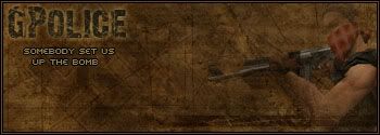
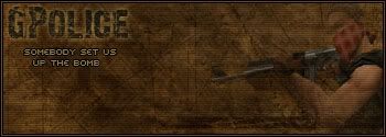
Any1, I made a terrorist sig that says somebody set us up the bomb and I need C&C, also I don't know whether to use scanlines or not.
Terror.jpg

TerrorScanlines.jpg

-
09-15-2004, 07:00 AM #1448
-
09-16-2004, 05:04 AM #1449

Old School Zelda

Wierd Abstract


-
09-16-2004, 05:07 AM #1450CallMeMasterGuest

OLD SCHOOL ZELDA!!!
Awsome...... 10/10
-
09-16-2004, 07:00 AM #1451Forum Member


- Join Date
- Sep 2004
- Location
- A Dark Hole Apart The Earth
- Posts
- 67

8/10 on the Old School Zelda, its good but I don't really like the bg.
The render isn't rendered too well around the right side of the hair and on the tannish-thing. The backround is kinda basic but it goes good with the render. Originally Posted by Anferny
6.8/10 (I couldn't decide between 6.5 and 7, leaning towards 7)
-
09-16-2004, 08:01 AM #1452

im showing off
hi
-
09-16-2004, 11:05 AM #1453
 ya i did extract in photoshop and the highlighter couldnt get anysmaller and the tannish thing is part of his sword (if u didnt know that its a anime)
 Originally Posted by GPolice
-
09-16-2004, 11:16 AM #1454Forum Member


- Join Date
- Sep 2004
- Location
- A Dark Hole Apart The Earth
- Posts
- 67
 Fer more accuracte renders set the Tolerence to 0 of the magic wand. I personally, zoom in 1600% and use a 1-5 px eraser to render stuff.
 Originally Posted by Anferny
-
09-16-2004, 11:30 AM #1455

i have photo shop but i dont know how to use it
-
09-16-2004, 12:27 PM #1456
-
09-16-2004, 12:32 PM #1457

how u make em?
-
09-16-2004, 01:02 PM #1458
 photoshop
 Originally Posted by thgrave2002
u made some lines with the gradent tool the line 1 and then after the 6-7 line about | | that thick i use the crome filter thing, then i changed the hue to that blue and changed the lightness to like 80ish thats for the blue 1 the red is just the inverted color
NOTE: i said that off memory it might be missing a few steps
-
09-16-2004, 01:58 PM #1459

could that be Base02 font for ur name? looks pretty good, u can just add stuff in it and it'll be all cool, u can also throw in there a border if u want, but u prob don't really need one since the colors are different from forum color.

-
09-16-2004, 02:30 PM #1460
Thread Information
Users Browsing this Thread
There are currently 9 users browsing this thread. (0 members and 9 guests)
Similar Threads
-
[FT] E/SC/L-3/3/2 OS Darkforce Spawn
By HellsAngel in forum USEast Non-LadderReplies: 0Last Post: 05-23-2005, 09:23 AM -
What is the difference...
By Obfuscate in forum Diablo II DiscussionReplies: 8Last Post: 03-08-2005, 07:14 PM -
Questions about this forums features.
By BlindMansTicket in forum Small TalkReplies: 4Last Post: 11-11-2004, 08:45 AM -
Running 2 Diablo2's???
By Darker_TRC in forum Diablo II DiscussionReplies: 3Last Post: 07-29-2004, 08:48 PM -
Help with Hero Editor
By mpeck in forum Hacks Bots and EditorsReplies: 1Last Post: 05-04-2004, 09:44 AM


Bookmarks